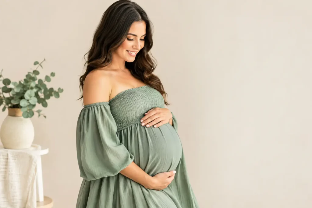
The best colors for maternity portraits are not necessarily the colors you see everywhere online. They are the shades that let your connection, your growing family, and this remarkable chapter take center stage. When you feel beautiful and at ease in what you wear, that confidence becomes part of every image – the kind your child may one day hold in their hands and recognize as the beginning of their story.
Color is one of the first choices we help expecting families make because it shapes the feeling of a portrait before the camera is ever lifted. The right palette can feel soft and timeless, warm and joyful, or quietly dramatic. It can also help a session feel beautifully connected without making everyone look overly matched.
How to Choose the Best Colors for Maternity Portraits
Start with the atmosphere you want your images to hold. Are you imagining a light, airy session on the beach at sunset? A quiet, intimate in-home session? A golden field, a historic St. Augustine setting, or a studio portrait where every detail feels intentional? The location and light will influence which colors shine most naturally.
Then consider the artwork you hope to create from your photographs. A color may look lovely on a phone screen, but the most enduring choices are usually those that still feel at home on your walls years from now. Soft neutrals, earthy tones, and gently muted colors tend to photograph with a sense of calm that does not chase a passing trend.
Most importantly, choose a color that feels like you. If cream has always been part of your wardrobe, it may feel effortless in your portraits. If you come alive in deep green or a rich rust tone, that is worth honoring. Guidance matters, but your maternity photos should never feel like you are wearing someone else’s vision of motherhood.
Soft Neutrals Create Timeless Maternity Images
Cream, ivory, oatmeal, sand, warm beige, and soft taupe are beloved for maternity portraits for good reason. These colors catch light beautifully, keep the focus on expression and connection, and work across a wide range of locations. They also pair easily with a partner’s and children’s outfits without requiring everyone to wear the same shade.
For outdoor sessions in St. Augustine and St. Johns County, warm neutrals are especially lovely against beach grass, coquina, historic stone, and golden evening light. A flowing ivory dress can feel luminous near the water, while oatmeal and camel add warmth in a field or wooded setting. In a studio, these tones create a clean, heirloom-quality foundation.
There is a small trade-off with white and pale ivory: bright sun can make pure white appear more brilliant than intended. A photographer can guide you on timing and exposure, but choosing cream, ecru, or a lightly textured fabric often preserves the soft look you love while adding dimension in photographs.
Earthy Colors Bring Warmth and Depth
For families drawn to grounded, organic portraits, earth tones are a beautiful choice. Think terracotta, cinnamon, rust, clay, olive, moss, caramel, mustard, and warm brown. These colors carry warmth without competing for attention, and they often complement the natural colors of Florida landscapes surprisingly well.
Terracotta and rust can be especially flattering in late-day light, bringing a gentle glow to the skin. Olive and moss feel peaceful against greenery and add richness to a neutral family wardrobe. Caramel or cognac layers beautifully with cream, linen, and soft denim for a relaxed look that still feels thoughtfully styled.
Earth tones are also helpful when you are planning a session with young children. A palette of olive, cream, camel, and muted floral prints has movement and personality, but it does not show every tiny smudge as quickly as very pale clothing can. That practical detail can make the experience feel more relaxed, particularly when little ones are part of the story.
Muted Blues, Greens, and Blush Tones Feel Gentle
If you prefer color but want a quiet, romantic look, softened shades are often the answer. Dusty blue, slate, muted sage, eucalyptus, smoky teal, blush, mauve, and lavender-gray photograph beautifully because they have a little gray or warmth mixed into them. They add personality while remaining gentle on the eye.
Sage and eucalyptus are lovely for outdoor maternity portraits, especially where palms, live oaks, or dune grass are part of the setting. Dusty blue and slate offer a classic option for families who want a cooler palette. Blush and muted mauve can be tender and feminine without becoming overly sweet, particularly when paired with natural linen, cream, or a soft brown accent.
The key is choosing muted rather than highly saturated versions of these colors. A bright emerald, hot pink, or electric blue can pull attention away from faces and make skin tones look less natural depending on the light. There is nothing wrong with bold color if it reflects your style, but it works best when used intentionally and balanced with quieter pieces.
Deep Colors Can Be Beautiful, Too
Not every maternity session needs to be light and airy. Deep navy, forest green, burgundy, plum, charcoal, and chocolate brown can create portraits with drama, elegance, and emotional depth. These tones are especially striking for studio sessions, overcast days, or families who prefer a more refined, editorial feel.
A rich color can be wonderful for a fitted dress that celebrates your silhouette. It can also give a partner or older child a meaningful role in the palette without asking them to wear something too formal. For example, a mother in soft cream with a partner in deep navy and a child in muted blue can feel connected, not coordinated down to the last detail.
Black can be stunning, particularly for more intimate studio maternity portraits. It creates shape and contrast, and it has a timeless confidence. For a bright beach session, however, black may feel visually heavier than the surroundings. This is where the setting, season, and feeling you want all matter more than any one rule.
Coordinate Your Family Without Matching Exactly
A successful family palette usually includes two or three main colors plus one subtle accent. Choose one person’s outfit first – often the expectant mother’s dress – then build the rest of the family around it. This lets the wardrobe feel connected while keeping your outfit as the visual anchor.
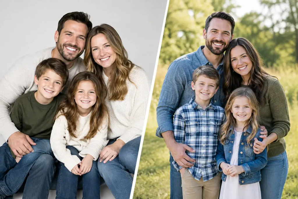
Instead of putting everyone in identical white shirts and jeans, vary the tones and textures. If you are wearing a cream dress, a partner might wear soft tan or muted blue, while a child wears a delicate floral pattern that includes cream and sage. Linen, cotton, knitwear, and soft layers photograph with more depth than stiff or shiny fabrics.
Patterns can absolutely work, but one pattern in a family is usually enough. Keep it small or softly colored, then let the other outfits pull colors from it. Avoid large logos, neon accents, and clothing with bold words across the front. Those details can date an image quickly and distract from the expressions you will want to remember.
Let Skin Tone and Comfort Lead the Decision
The most flattering color is often the one that brings warmth and clarity to your face. If you tend to look best in warm jewelry and cream rather than stark white, try camel, olive, rust, peachy blush, or warm ivory. If cooler colors make you feel more like yourself, explore slate blue, muted mauve, soft navy, or sage with a gray undertone.
You do not need to decode your exact seasonal color analysis to make a beautiful choice. Hold possible fabrics near your face in natural window light. Notice which shades make your skin look rested and which ones make you feel washed out. Your response matters as much as any styling guideline.
Comfort deserves equal attention. Pregnancy changes how clothing feels, and a color you love cannot compensate for a dress that pinches, slips, or makes you self-conscious. Choose pieces that allow you to move, sit, walk, and be held by the people you love. The most meaningful images often happen in those unplanned in-between moments.
At Willow & Roots Studios, wardrobe planning is part of the guidance, not another task you have to figure out alone. Bring the colors and pieces you are considering, along with the feeling you hope for, and let the final choices support the legacy you are creating. Your portraits do not need to look like anyone else’s – they only need to feel honestly, beautifully like the family waiting to meet one another.